Data + Art STEAM Project: Initial Results
Big news
I've been incredibly fortunate as of late to work on an exciting STEAM project! STEAM stands for science, technology, education, art and math. It's a term typically used in reference to education projects combining the subjects to creatively investigate a research area, solve a problem and teach students new skills.
When I travelled back to Toronto in February, I met up with my good friend Katherine Lafranier. Katherine, is a teacher to gifted grade 6 students at Forest Hill Junior and Senior Public School. She was telling me how she just finished up a unit on data management. Her students were already using Google Sheets for their analysis and graphing. She saw my article on RAWGraphs.io and was considering unleashing them on that tool as well.

An idea is born
I was shocked at how early the students were working on data! We started brainstorming about cool data projects and we came up with the concept of having the kids design a research project to explore a topic of their choice. Their friends and schoolmates would be the subjects and they would gather data through surveys.
Where's the Art?
If you've seen just about any other page on my blog, you will notice that I'm a sucker for beautiful data visualization! To communicate their findings in the research project, we wanted to focus on effective data visualizations. Oddly enough, right about the same time, one of my instagram connections Letícia A. Pozza reached out to say that she is holding a data + art installation in Brazil. She wanted to know if I had anything to display. Of course the answer had to be YES, but we just needed to figure out how to mobilize this project to be applicable for an art installation. I reached out to Katherine, and she had the idea of rolling up all of the data visualizations to a large mosaic style image of one of the graphs selected!

An example mockup of a word graph chart created with a series of graphs and images produced during the research. The mockup was created with AndreaMosaic.
Overview
Students select a topic they are interested in researching. They gather data through surveys with their schoolmates being the subjects. Presentations, outlines and survey criteria are included in the materials below.
All data is submitted and consolidated into one csv file.
Students and mentors use the data to create a large collection of images. Image types include: data visualizations, hand drawn graphs, hand drawn images, photographs taken throughout the process, quotes from open text survey responses and other creative ideas.
All images are rolled up into a large mosaic graphic that captures the subject area. This will be the main display. See the inset for an example of the mockup image.
A write up is completed to compliment the display. It outlines what the students learned during the investigation. The write up will include a few images from the mosaic to highlight learnings.
Materials

After creating the survey as a class, I sent back the final copy to Katherine. She went through it with their students to get their final approval. They sent it back with final comments and revisions.
The steps are outlined in my github repo. The overall outline for the project is available in pdf and word doc. Additionally, the project introduction keynote and pdf files are available.
If you have trouble downloading the file from github, go to the main page of the repo and select "Clone or Download" and then "Download Zip".
Project Topic
For our research project the students picked the subject: "Self-analysis: Exploring student lifestyles and how it relates to their self-perception"
The final survey format is available here.
Early Results
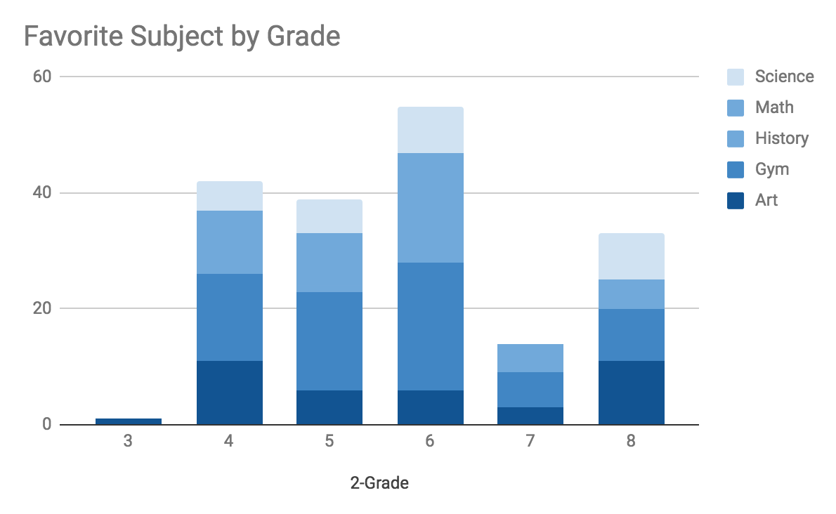
We are currently in step 3 of the project as outlined in the "Overview" section above. The students have created the survey, completed all surveying and we have a consolidated data set. The students are working on image and graph creation. I've been fortunate enough to get a first pass at the data visualizations and have included some of the sample graphs below.
Graph Samples: Basic Graphs
It made sense to start the data visualizations with Google Sheets. It is a free tool that the students already use. In my opinion it's a solid free alternative to Excel that makes effective trend and total style graphs.
Technical Tips: If you have experience with Excel pivot tables and want to try Google Sheets, I'd suggest you start by going to the top navigation and select "Data" > "Pivot Table". Then use the right hand pop-out to add fields to the "Rows", "Columns" and "Values" areas to create your summary table. Note that "Values" can be aggregated by count, sum, avg. When you have your summary table complete and you are ready to insert a chart select "Insert" > "Chart" and change the "Chart Type" to your liking.


Graph Samples: Pictorial Graphics
It can be very effective to use pictorial style graphs to create eye-catching data visualizations. Pictorial graphics are often used to create infographics. To create the graphs below I used Infogram.
Technical Tips: Infogram is a very straight forward tool. To get started, you need your data already summarized. For example, I needed to have the average screen times by introvert/extravert category already calculated for the graphs below. You then find a graph type you like, replace the example data with your actual data, modify icons, colors etc and voila, you are done!


Average time spent on screens per week by social factors

Graph Samples: Complex Visualizations
I had to include graph creation with RAWGraphs.io It is such a straight-forward and accessible tool to use without any need for coding! The RAWGraph platform makes graphs accessible that are typically only available via Python, R, D3.
Technical Tips: I have previously created a tutorial on RAWGraphs.io. If you are interested in the tool, I'd suggest checking it out!


Graph Samples: Relationship visualization
Next up, I wanted to graph the relationship between our numerical variables: ScreenTime (hrs screen time per day), Sleep (hrs sleep a night), PhysActive (hrs physically active per week), HoursHomework (hrs of homework per week).
One of the best ways to get a grip on relationships is to start with a basic correlation plot. I chose R because it has a variety of really great options to display correlation plots. My code is uploaded to the project repo here.
When looking at the graph below, its very interesting to note that as screen time increases, sleep time decreases. Of course correlation does not equal causation, but we should explore this further.


Graph Samples: Relationships through scatterplots
Next, I wanted to graph scatterplots of these relationships. I chose R again because of the easy and powerful ggplot2 plotting functionality. My code is uploaded to the project repo here.
I started out looking at various factors by gender and didn't see any major differences.


I continued by looking at the 1:1 relationships between numerical variables and grade. In this discussion I believe that grade can be used as a proxy for age. I also added a regression line to see the trend of the variable relationships. At first blush it looks like the time spent on homework increases with age. Time spent sleeping decreases with age. Time spent on physical activity decreases with age. Finally, time spent on screens increases with age.


I then looked at how screen time may be related to sleep time. From the graph below, it would appear that as screen time increases, sleep time decreases. But wait! There may be a confounding factor here: age. If you look above, sleep decreases with age and screen time increases with age. So we isolate for age by plotting each age in their own graph. Still, we see a similar trend that sleep time decreases with an increase in screen time. Please keep in mind that we are just looking at trends here. We would need more data and testing to more concretely declare this as fact.


Graph Samples: Additional Factor Visualizations
I continued the fun by using the ggstatsplot package to create a scatterplot and density combination chart. I explored homework time and sleep by favorite subject. Finally, I used a violin plot to look at the spectrum of sleep time by sociability factors (introvert/extravert). My code is uploaded to the project repo here.


Graph Samples: Word Charts
Finally, I created some word plots. The star word plot outlines the students desired future career. The comment word plot outlines how the students view themselves. The heart word plot outlines how the students like to spend their time.
I created these plots with Tagxedo because I like the shapes can produce. However, you could use Wordle or any other tool you have available to you. They are all quite straight forward.


Call for Participation
This is the first pass at this project. However, I have a number of contacts in the data scene that are interested in running another set of these projects possibly in coordination with other classrooms around the world. If you are interested in participating, please contact me by filling out the contact form.
Teachers, there is an opportunity to request your classrooms participation.
Data folks, you can request to participate as mentors in the next project. Also, if you are itching to take a crack at the current dataset, you can find it here. Please feel free to send me any results and we may include them in the final project.
Thank you and Stay Tuned
We are not complete with our STEAM project yet! The students need to create the images. As a team, we need to produce our mosaic image, create the write up and select the highlight images. We also have a surprise in store for how we are going to display the results from this project. Thank you again for reading about our STEAM project. Stay tuned for more information!
Update
I completed this project in October 2018. Please check out the final write up here.