Predictive Analytics Tutorial: Part 3
Hi Again!
Welcome to part 3 of this 4-part tutorial series on predictive analytics. The goal of this tutorial is to provide an in-depth example of using predictive analytic techniques that can be replicated to solve your business use case. In my previous blog posts, I covered the first three phases of performing predictive modeling: Define, Set Up and EDA. In this tutorial, I will be covering the fourth phase of predictive modeling: Transform.

Upon completion of the first and second tutorials, we had understood the problem, set up our Data Science Experience (DSX) environment, imported the data and explored it in detail. To continue, you can follow along with the steps below by copying and pasting the code into the data science experience notebook cells and hitting the "run cell" button. Or you can download the full code from my github repository.

Log back into Data Science Experience - Find your project and open the notebook. Click the little pencil button icon in the upper right hand side of the notebook to edit. This will allow you to modify and execute notebook cells.

Re-Run all of your cells from the previous tutorials - Minimally, every time you open up your R environment (local or DSX), you need to reload your data and reload all required packages. For the purposes of this tutorial also please rename your data frame as you did in the last tutorial. Remember to run your code, select the cell and hit the "run cell" button that looks like a right-facing arrow.

*Tip: In DSX there is a shortcut to allow you to rerun all cells again, or all cells above or below the selected cell. This is an awesome time saver.
Baseline our goals - It's important to remind ourselves of our goals from part 1. In short, we are trying to create a predictive model to estimate "average_monthly_hours". This will allow us to estimate how many hours our current employee base is likely to work.
Transform Data
In the transformation phase, we take everything we have learned from exploring the data and use it to prep our data set for predictive modelling. The techniques could include modifying the columns so that they can be included in the predictive model, or modifying the columns to make them even higher performing for the model. We will walk through some examples below.
Create Dummy Variables
One of the easiest ways to transform your data is to create dummy variables. Dummy variables are used as a way of including text based values into our number based predictive models. For example, the data set has a column called "salary" which takes on the values: high, medium and low. Since a predictive model can only use numbers to calculate the predicted value, the "salary" column can't be considered as a possible input to predicting "average hours worked". But this isn't right! Salary, may have a large effect on average hours worked. To get around this, we create binary/dummy variables. With the dummies r package, we can easily create three new columns for each possible salary value and then assign a 0 (no) or 1 (yes) to indicate if the column is that value. For example: to include the "salary" value, we call the dummies package and it automatically creates three new binary (0/1) columns: "NAhigh", "NAmedium" and "NAlow". Each column represents a possible category assignment for each for the "salary" values. If we take an example row, where a particular employee row would have the value with "salary" = "medium", the value of "NAhigh" would be 0 (meaning salary is not equal to high), "NAmedium" would be 1 (meaning salary is equal to medium) and "NAlow" would be 0 (meaning salary is not equal to low).
To create all dummy variables for the data set simply run the code below
#create dummy variables for job and salary
hr2 <- cbind (hr, dummy(job), dummy(salary))
Next, take a peek at your data set and ensure that the dummy variables are assigning values as expected.
#Ensure dummy variables are created
names(hr2)
head(hr2)
Create "cleaner" versions of existing variables
When working with our columns/variables, it can be beneficial to have more standardized versions of these variables. By taking the log, square root or scaling our variables we can make our data set a little more robust to outliers and differences in units between variables. To create "cleaner" versions of existing variables, you can do a wide range of transformations. Below are a few examples:
#Log Transforms for: satLevel, lastEval
hr2$satLevelLog <- log(satLevel)
hr2$lastEvalLog <- log(lastEval)

#SQRT Transforms for: satLevel, lastEval
hr2$satLevelSqrt <- sqrt(satLevel)
hr2$lastEvalSqrt <- sqrt(lastEval)

#Scale Transforms for: satLevel, lastEval
hr2$satLevelScale <- scale(satLevel)
hr2$lastEvalScale <- scale(lastEval)
Next take a peek at your data set and ensure that the values are being assigned as expected.
#Ensure all columns present
names(hr2)
#Peek at new columns
head(hr2)
Create Interaction Variables
One of your objectives when transforming your data is to modify the variables to have a larger impact on the value you are trying to predict. For example, when doing our data exploration; both the last evaluation and satisfaction level had an impact on the hours worked by an employee. However, it was found that there was a concentration of employees who had a high last evaluation score (greater than 80%) and low satisfaction score (lower than 20%). Therefore, we should look into this group and see the impact that it has on our average hours worked.

Identifier for highly rated but low satisfaction users
hr2$greatEvalLowSat <- ifelse(lastEval>0.8 & satLevel <0.2, 1, 0)#Visualize effects that it has on average hours
attach(hr2)
x <- ggplot(hr2, aes(factor(greatEvalLowSat), avgHrs))
x <- x + geom_boxplot (aes(fill=factor(greatEvalLowSat)), outlier.color="black", outlier.size=1)
x <- x + coord_flip()
x + scale_fill_manual(values=wes_palette(n=2, name="GrandBudapest2"))Look at the distribution of this new variable
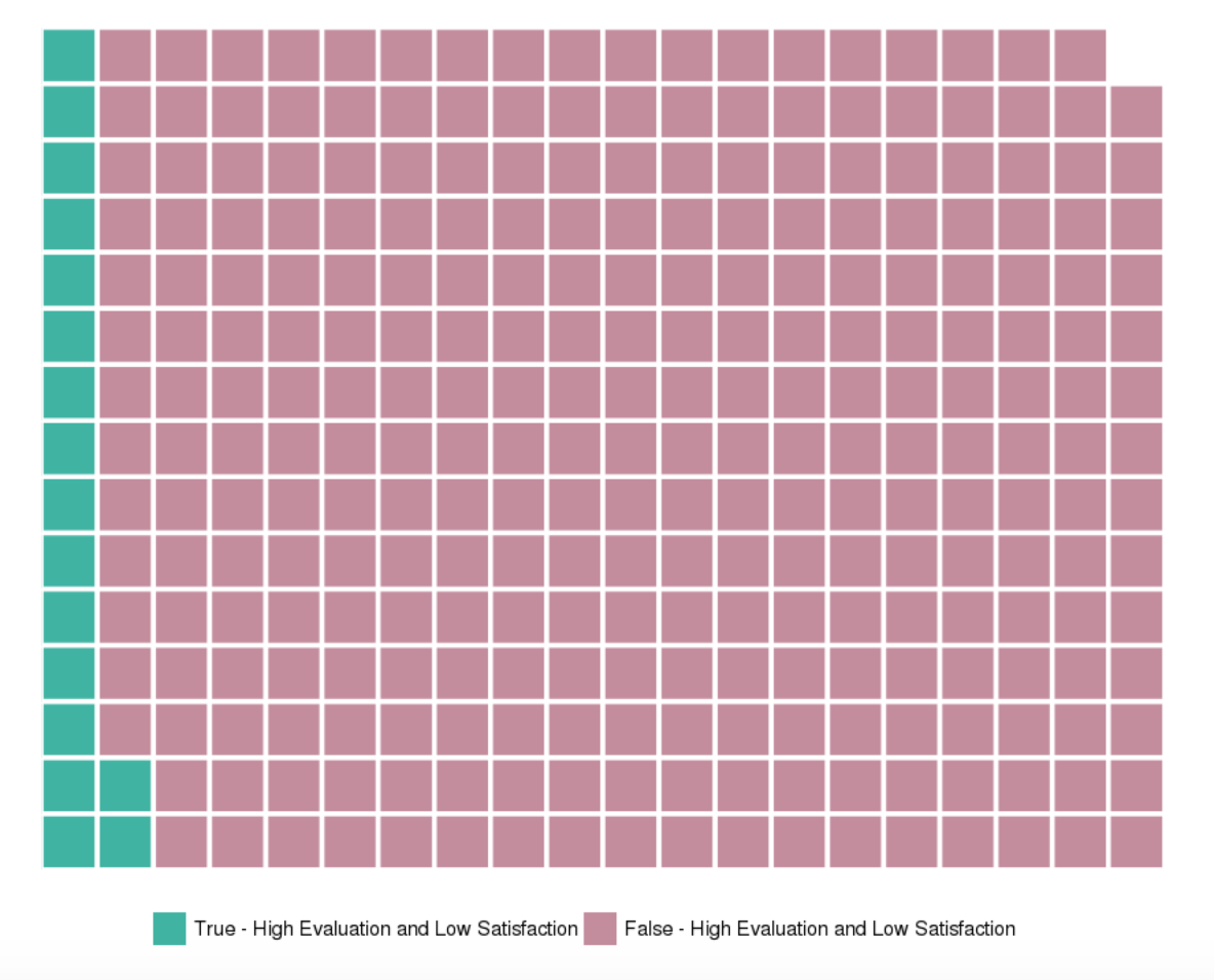
From above, we can see that the new variable has an impact on the average hours worked. Normal users have an average of about 200 hours worked, whereas highly evaluated and low satisfaction users have an average of about 270. But the next question is, how many users do and do not fit this criteria? A simple histogram can be a very clean way of looking at this distribution, but a waffle chart representing relative distribution can be more fun!
#Get distribution table
summary <- count(avgHrs, c('greatEvalLowSat'))
summary

#Visualize distribution proportions in a waffle chart.  Divide by 50 simply for visual effects.
wafflechart <- c(`True - High Evaluation and Low Satisfaction`= 895/50, `False - High Evaluation and Low Satisfaction`=14104/50)
waffle(wafflechart, rows=15, size=1, colors=c("#41b3a3", "#c38d9e"), legend_pos="bottom")
Split data set into training and testing
As part of our data transformation step, we need to take the data set provided and sample it to create the training and testing and data sets. The training data set will be used to create and select the candidate predictive models. We will then use the testing data set as a final test for the predictive models performance.
#Create train and test data sets
#Starting code credit to: https://stackoverflow.com/questions/17200114/how-to-split-data-into-training-testing-sets-using-sample-function
set.seed(101)
sample = sample.split(hr2, SplitRatio = .75)
train = subset(hr2, sample == TRUE)
test  = subset(hr2, sample == FALSE)

#See if the test/train sets have been split appropriately.
#Dim shows the dimensions of the data set (rows, columns)
#You're looking for about a 75% split as seen in the SplitRatio above.
dim(train)
dim(test)

#Ensure data characteristics are roughly the same
summary(train)
summary(test)
Summary
During this tutorial we have transformed our data set to get all set for our final phases of the predictive analytics tutorial: model, assess and implement.
Thank you for reading. Please comment below if you enjoyed this blog, have questions or would like to see something different in the future.
Written by Laura Ellis