PixieDust - A Python library spreading magic on our notebooks

I just returned from a 6 day long trip to Disney World with my husband and two young daughters. Needless to say we saw pretty much every princess, fairy or female cartoon character in the parks. See inset picture for cuteness.
Fresh off my Disney trip I am inspired to write about something really cool that I’ve been thinking about for a while now: PixieDust! No, not the fairy dust that Tinkerbell uses. It’s an open source Python helper library used to make data exploration and visualization easier in notebooks.
I first found out about this when I was at Interconnect this past March. I sat down to do a hands on lab, ran a few commands, and then saw something really strange happen to my Jupyter notebook. It became interactive! WHAAAT? I’d never performed interactions within a Jupyter notebook output cell before. Cool! For background, typically when creating data visualizations, you would pick a data visualization package and then start writing individual charts one by one. If the data is not visualized the way you like it, you need to modify the code, rerun and iterate from there.
During the session I began excitedly asking the lab monitors so many questions about how it works that they introduced me to the inventor: David Taieb. David is a distinguished engineer with IBM Watson Data Platform. He explained that when he began working with data packages in Python notebooks he was in awe of their potential. They are incredibly powerful. However modifying your visualization can seem unnecessarily hard. Worse, if you want to give another visualization engine a try, you need to learn all new syntax.
He thought if he could only sprinkle a little magic on these tools, he could unleash it’s full potential to a wider audience. As a father himself, he paralleled the idea to Tinkerbell sprinkling pixie dust. An idea was born!
Below, I’m going to review a tutorial I wrote to introduce readers to PixieDust and PixieApp. First I'd like to give credit to the easy hello world tutorials on pixiedust and pixieapp provided by David Taieb and Patrick Titzler.
My Tutorial Link: https://github.com/lgellis/pixiedust-pixieapp-collegedata
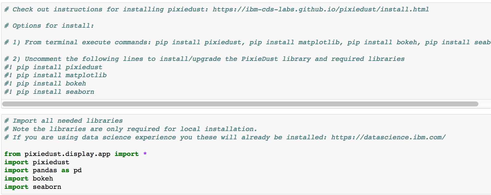
Step 1: Install the and import the necessary libraries
I created this demo using my local install of Python and Jupyter notebooks. Therefore, before you get started, you need to install and import the necessary libraries. However, if you are using notebooks within the Data Science Experience platform, the libraries are already installed for you.
Step 2: Gather college data from the ISLR project
The ISLR (Introduction to Statistical Learning with applications in R) project is an excellent source for well documented and well explored data sets. The book itself offers in depth and comprehensive samples of data science applications in R. The data science open source community has extensively built on this resource. Most of the code has been extended to additional languages and features.

Step 3: Preview Data
Have a quick look at the data through the head command

Step 4: Explore the data through PixieDust
I would first like to note that to get started with the interactive data exploration it is one simple command: “display(dataframe)”. At this point the data is yours to explore. There are a couple of main features that you may want to take note of here. In the table view you get to explore both the schema and a scroll-able preview of the data. Typically, these functions involve code. Additionally, the data preview is not scroll-able, which makes digesting the content more difficult.
In the visualization view you can get started with understanding your data set. You can create all sorts of basic plots: bar charts, line charts, scatter plots, maps etc. Depending on the graph there are a number of more advanced options such as time series, clustering etc. Visually, you can adjust chart size and format of the chart features such as title, legend display and more. Just think about it, without PixieDust, all of the above tasks require incremental code changes. But the real kicker: you can dynamically change the visualization library. This is a biggie, because to change the visualization library typically requires a completely new syntax.
Lastly, you can download the data in a variety of formats including csv, xml and json. This is a small but consistently needed time saving feature.

Step 5: Display the data in a consumable dashboard through PixieApp
A recent addition to the PixieDust library is the PixieApp functionality. PixieApps are Python classes used to write UI elements right in notebooks. While notebooks are incredibly beneficial for sharing code output easily, PixieApp makes output sharing even more consumable. Using a combination of html and PixieDust commands, you can create a small dashboard within your app. I created a very simple proof of concept dashboard to compare the value of private vs public college education.


A very simple proof of concept dashboard using PixieApp and ISLR college data set.
Summary
I hope that this review and tutorial were beneficial to you. In full disclaimer, I have since learned that there are a few other interactive data visualization tools out there such as Plotly and PivotTable.js. However, in exploring them I still prefer PixieDust. It has the ability get up and running with one line of code and no external login. The visualization content, technique, rendering library and display options are configurable within the display. At this point I have not seen another option rivaling this.
Let me know what you think of the library and if you like it, please add to the knowledge base!
Written by Laura Ellis