Happy International Women's Day!
As a tribute to International Women's Day, I am doing a little analysis on some gender equality among EU countries. The analysis will all be hinging on the values of the EU gender equality index. As per wikipedia, the gender equality index is a tool that measures:
“how far (or close) the EU and its Member States are from achieving a gender-equal society. The measurement used produces a score that ranges between 1 and 100, where 100 stands for the best situation, where there are no gender gaps combined with the highest level of achievement.”
I think it's pretty great that they are keeping such an active eye on gender equality within the EU! I found the data set with high level index values and a breakdown of more granular ranking categories through the European institute for gender equality.
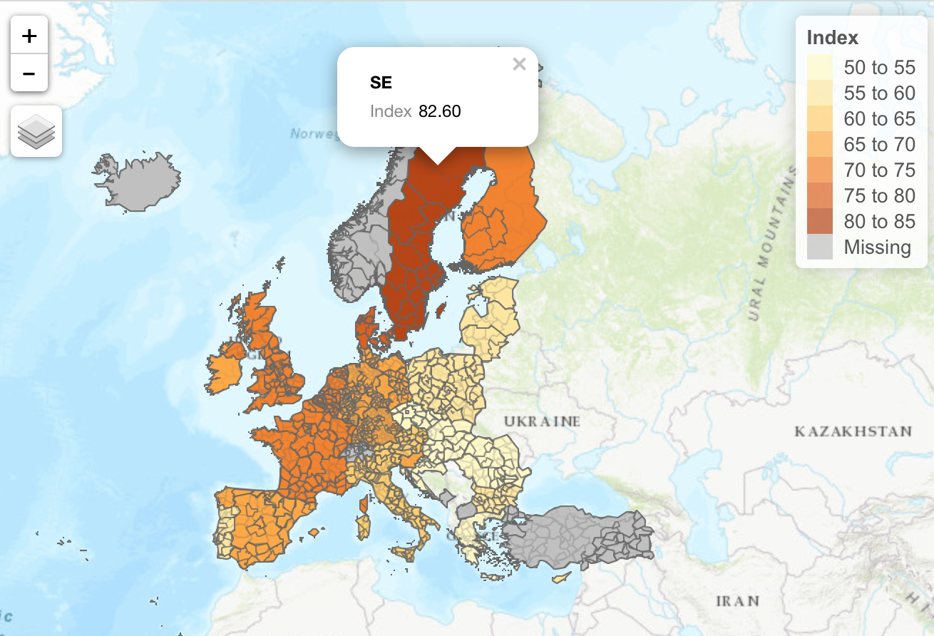
To get started, I wanted to use trusty R to plot a choropleth map of the most recent (2015) gender equality index values. Note that I am just getting started with mapping in R and so I found a great tutorial that did choropleth plotting from shape files very efficiently. I just modified to make it my own.
Use R to plot EU Gender Equality Index on a Map
Code available from GH
# Base code from -https://www.computerworld.com/article/3175623/data-analytics/mapping-in-r-just-got-a-whole-lot-easier.html

install.packages("tmap")
install.packages("tmaptools")
install.packages("data.table")
library(data.table)
library("tmap")
library("tmaptools")

#Download the shape files from:
#Replace the path with the path to your shape file
eurGeoMap <- read_shape("/iwd2018/NUTS_2013_01M_SH/Data/NUTS_RG_01M_2013.shp", as.sf = TRUE, stringsAsFactors = FALSE)

#Download the equality data directly from GH.
#Equality data sourced from: https://data.europa.eu
eurEquality= fread('https://raw.githubusercontent.com/lgellis/MiscTutorial/master/IWD_2018/2015_equalityIndex.csv')
eurGeoMap$country <-substr(eurGeoMap$NUTS_ID, 1, 2)
eurGeoMap$country
eurEqualityMap <- append_data(eurGeoMap, eurEquality, key.shp = "country", key.data = "Country")

tmap_mode("view")
tm_shape(eurEqualityMap) + tm_polygons("Index", id = "country")
Voila! We have a great map below plotting out the gender equality index by EU country. As can be seen below, Sweden (SE) has the highest index value.
Explore Equality Index with Circle Packing
Next, I wanted to look at the same values with a circle packing chart. A very simple and easy way to do this is through RAWGraphs.io. It's a tool that can be used to create data science like graphs but without the code. If you would like a more in depth overview, please see my previous RAWGraphs.io tutorial.
For a quick getting started:
Visit rawgraphs.io
Copy and paste the csv values the "2015 equality index" csv on my github repo.
Select the "Circle Packing" graph
Map the dimensions as below
Enjoy your graph!


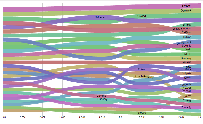
Explore Equality Index Over Time with bump chart
Finally, I wanted to look at the progress of countries over time. Again we are going to use RAWGraphs.io. If you would like a more in depth overview, please see my previous RAWGraphs.io tutorial.
For a quick getting started:
Visit rawgraphs.io
Copy and paste the csv values the "Gender equality index over time" csv from my github repo.
Select the "Bump Chart" graph
Map the dimensions as below
Enjoy your graph!


Thank You
Thank you for exploring the EU gender equality index values with me on International Women's Day 2018!
Please comment below if you enjoyed this blog, have questions, or would like to see something different in the future. Note that data sets are available for download from my github repo. If you have trouble downloading the file from github, go to the main page of the repo and select "Clone or Download" and then "Download Zip".