Create interactive ggplot graphs with plotly
One of the main reasons that I fell in love with R is for ggplot2. As Jennifer Thompson so eloquently put it:
“I *used* R before ggplot, but I never loved until then”
As someone very interested in storytelling, ggplot2 is easily my data visualization tool of choice. It is like the Swiss army knife for data visualization. One of my favorite features is the ability to pack a graph chock-full of dimensions. This ability is incredibly handy during the data exploration phases. However, sometimes I find myself wanting to look at trends without all the noise. Specifically, I often want to look at very dense scatterplots for outliers. Ggplot2 is great at this, but when we’ve isolated the points we want to understand, we can’t easily examine all possible dimensions right in the static charts.
Enter plotly. The plotly package and ggploty function do an excellent job at taking our high quality ggplot2 graphs and making them interactive.
During this tutorial, we are going to explore the median reported wages of creative occupations within the city of Austin for 2016 and 2017. This data set was sourced from the Austin open data portal. The AustinGO2.0 team is amazing for continually making new and exciting local data sets available for us to explore!
Install and Load Packages in R
Before we get rolling, we need to install and load the necessary packages.
##### Install and load packages
install.packages("plotly")
install.packages("tidyverse")
install.packages("htmlwidgets")
library(plotly)
library(tidyverse)
library(htmlwidgets)
Load The Data Set in R
To make things more reproducible, I have download the data set from the Austin open data portal and uploaded it to my github repo.
##### Import data

creatives <- read.csv(file="https://raw.githubusercontent.com/lgellis/MiscTutorial/master/ggplotly/Median_Earnings_of_Creative_Sector_Occupations__CLL.B.1.csv",
                      header=TRUE, sep=",", stringsAsFactors = FALSE)

dim(creatives)
summary(creatives)
str(creatives)
head(creatives)
Transform the data in R
We are performing some simple transformations to prep the data for an easy scatterplot. First, I renamed the columns and then I created a new column to calculate the 2016 to 2017 year over year percent changes in median wage per occupation.
##### Data processing
#Rename the columns and create a new column for year over year change

creatives <- creatives %>%
  rename(Median_2016 = X2016.Median.hourly.earnings, Median_2017 = X2017.Median.hourly.earnings) %>%
  rowwise() %>%
  mutate(Percent_Improvement = round((Median_2017-Median_2016)/Median_2016*100,2))
Create the interactive ggplot scatterplot
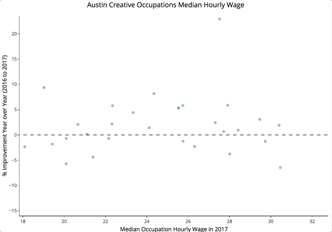
I created a simple ggplot2 scatterplot of the occupations showing the 2017 median wage vs year over year percent improvement. I added a simple horizontal line to mark zero on the plot. This allows us to more easily digest the year over year changes in median wage. We then take one final step and input our ggplot2 scatterplot into the ggplotly function. This creates an interactive graph!
##### Create a scatterPlot

scatterPlot <- creatives %>%
  ggplot(aes(x = Median_2017, y = Percent_Improvement)) +
  geom_point(alpha=0.7, colour = "#51A0D5") +
  labs(x = "Median Occupation Hourly Wage in 2017",
       y = "% Improvement Year over Year (2016 to 2017)",
       title = "Austin Creative Occupations Median Hourly Wage") +
  geom_hline(yintercept=0, linetype="dashed", color = "#2C528C", size=0.5) +
  theme_classic()

ggplotly(scatterPlot)
Add the Labels to the Graph
The above graph is great because we’ve successfully used plotly to make the ggplot2 scatterplot interactive. However, the mouseover data doesn’t have everything we want and it’s not very nicely formatted. Let’s fix this!
Shout out to Corinne Leopold on my team, who found a much more efficient way of assigning labels in the plots than the solution I was previously using. We simply add the mouseover details through the ggplot aesthetic text property. We then assign it to the tooltip in the ggplotly function.
##### Adding text

scatterPlot <- creatives %>%
  ggplot(aes(x = Median_2017, y = Percent_Improvement,
             text = paste(
               "Occupation: ", Occupation, "\n",
                          "2017: ", Median_2017, "\n",
                          "2016: ", Median_2016, "\n",
                          "% Improvement Year over Year: ", Percent_Improvement, "\n",
                          sep = ""
               ))) +
  geom_point(alpha=0.7, colour = "#51A0D5") +
  labs(x = "Median Occupation Hourly Wage in 2017",
       y = "% Improvement Year over Year (2016 to 2017)",
       title = "Austin Creative Occupations Median Hourly Wage") +
  geom_hline(yintercept=0, linetype="dashed", color = "#2C528C", size=0.5) +
  theme_classic()

ggplotly(scatterPlot, tooltip = "text")
Save the Data Locally
Now we have the interactive scatterplot and it’s time to share it around! Start by saving locally.
##### Save it locally
htmlwidgets::saveWidget(as_widget(p), "OccupationWages.html")
Save the Data on plot.ly
You may also want to share your interactive graph by sending folks a link. A super easy way of doing this is just to upload it to your plotly account. Simply make an account, create your API keys and then run the code below with your username and password.
##### Save it  on ploty

#Create a plotly account: https://plot.ly/
#Create API Keys: https://plot.ly/settings/api

Sys.setenv("plotly_username"="USERNAME")
Sys.setenv("plotly_api_key"="PASSWORD")

#Save to online file
api_create(scatterPlot, filename = "Occupation Wages")
Optional Note: if you want to save the tooltip text like the last example, just save your ggplotly graph to a variable with the tooltip and then run the api create command.
sp <- ggplotly(scatterPlot, tooltip = "text")
api_create(sp, filename = "Occupation Wages")
After running the code, the URL for your hosted plotly chart will pop up and voila, you have a hosted plotly graph! You can send it off to friends and colleagues or you can embed it into a website like I did!
Thank You
Thank you for exploring how we can use the plotly package to make our ggplots interactive. Please comment below if you enjoyed this blog, have questions, or would like to see something different in the future. Note that the full code is available on my github repo. Due to some great suggestions on twitter by Christin Zasada and Alison Hill, I even included a nicely formatted .md file with the code and output displayed for easier reproducibility.
If you have trouble downloading the files or cloning the repo from github, please go to the main page of the repo and select "Clone or Download" and then "Download Zip". Alternatively or you can execute the following R commands to download the whole repo through R (an awesome suggestion by Itamar Caspi)
install.packages("usethis")
library(usethis)
use_course("https://github.com/lgellis/MiscTutorial/archive/master.zip")