Free Hosted Dashboards in IBM Watson Studio
As data people, we very typically spend a great deal of time summarizing our findings to stakeholders in a clear, concise and impactful way. Often times, due to the lack of infrastructure, we end up using presentation files with chart images. This can become a real pain when we need to make modifications or when the analysis needs to “live on”. Typically, this is where BI (business intelligence) or dashboard tools shine. Unfortunately, this can be a major stumbling block for smaller shops who rely on a lot of local analysis and may not have the budget for a BI tool.
Lately, I’ve been showcasing some of the freely available and hosted data science and BI tools that Watson Studio has to offer. In my last Watson Studio tutorial, I showed how to use the platform for hosted and collaborative R (or Python) programming in both a notebook and RStudio environment.
For this tutorial, I’ll focus on mobilizing your data insights through integrated, hosted dashboards. To get you excited, I’ve posted a sneak peek at the completed (and very easy to create) hosted dashboard below.

The Environment
While you can create hosted Cognos dashboards outside of Watson Studio, I wanted to show you the full integrated data science platform experience. Within a Watson Studio project, you can do everything from import data, modify and refine it, create models, perform natural language and visual recognition analysis, perform custom data science with R and Python in a variety of IDEs and more. With the addition of Cognos embedded dashboards, you can now mobilize any of this data output with a hosted drag and drop dashboard in the same interface!
Sign up for IBM Cloud
Visit https://cloud.ibm.com/registration
Follow the steps to activate and set up your account.

Deploy Watson Studio from the catalog.
Search for “Watson Studio” in the catalog. Select the "Lite" plan and hit "Create".
You will then be taken to a new screen where you can click to "Get started”. This will redirect you to the Watson Studio UI.
When you arrive in the Watson Studio UI, it will have you create some default settings and take you on a tour of the interface.
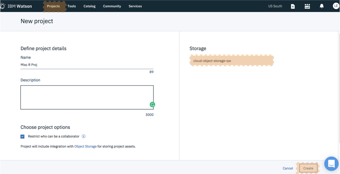
Create a New Project
You can create a project from the main Watson Studio dashboard, or by clicking to the "Projects" area in the top nav and selecting "New Project". When selecting your new project type, select "Standard". This will allow you to see all of the bells and whistles IBM Watson Studio has to offer! If this is your first project, you will also need to create an object storage service to store your data. This is a free service and just a few clicks to set up. When you have clicked through the object storage service creation UI, hit "refresh" and then you can select your storage service and hit "Create" to create your project!
Identify your data
While you are welcome to use any data set that interests you, I will be using the same Zillow data set that I used in a previous dashboard tutorial.
The sample data set can be downloaded from my github repo. Note: if you have trouble downloading the file from github, go to the main page and select "Clone or Download" and then "Download Zip".
Import your data
Note that data sets can be manually uploaded or created right within Watson Studio programmatically as part of your data science pipeline output. In a previous tutorial, I showed how to programmatically store data sets created in R or Python to your project space.
To manually import data to your project, select the “1010” button in the top nav. Select “Load” and then either drag and drop your csv into the interface, or browse to upload.

Create Your Dashboard
Now that your data set is available in the project , you can add a dashboard to mobilize it. Select “Add to Project” in the top nav and then select “Dashboard”.
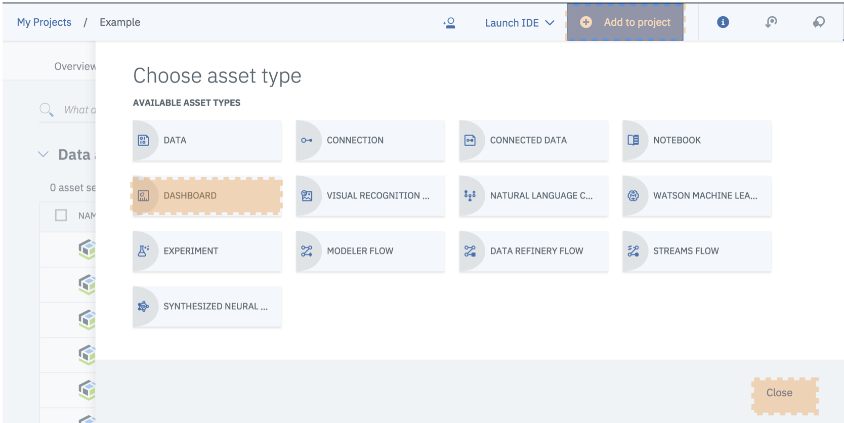
If this is your first dashboard, you will also need to create a “Cognos Dashboard Embedded” service. This is also free and just a few clicks away. When you have clicked through the Cognos service creation UI, hit "refresh" and select your Cognos service. Hit "Create" to initialize your new dashboard!
When your dashboard is first created, you are prompted to select a dashboard template. Having a template with some object grids defined, allows you to easily drag and drop charts that snap into place and auto-size. Personally I like a tabbed layout and I chose the one with 4 working areas in the header.

Select the data for your dashboard
While we created this project for the purpose of a one data source dashboard, this is not usually the case. Typically, you will have many data sources saved within your project space that you are working on or have created. As such, you’ll want to point Cognos to the data source that you intend to visualize. Note that you can also do this during chart creation and you can reference multiple data sources in the same dashboard.
Select the “+” to access all of the data sources in your project space. Select the desired source (in our case the Zillow csv) and hit OK.

Add Content to the dashboard
Now for the fun part, it’s time to add a graph! Graph selection is something that they’ve done very well with this release. They’ve included all of the basics like bar charts and crosstabs. But, they’ve also included some of the fancier graphs like maps, network graphs and tree maps.
Add a Map
We will begin our chart creation by adding a map graph. Map graphs are an excellent way of displaying geographic data in an easy to digest manner.

Select the chart icon and then select “Map”.
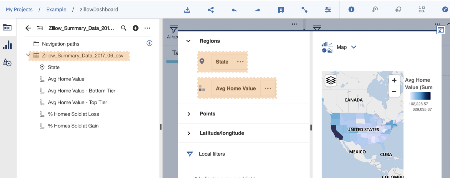
We are then moved to the chart editor interface. Here we select our data source and start dragging and dropping data values to create the graph.
We will identify regions by State and we will use the “Avg Home Value” data points to shade the map.
Add a Summary Metric
We will also add a “Summary” chart. These charts display one overall number or calculation. They are typically very useful on scorecard type of dashboards or infographics. In this case, we are using it to display the average values of our metrics across all states.
Select the “summary” graph.
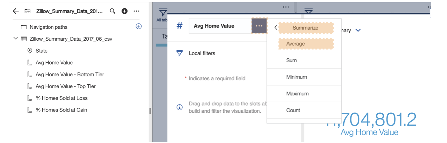
Drag the summary value you are interested into the “#” value.
It’s very important that we specify how we would like Cognos to summarize these values. We would like to display the overall metric average, but we could go with a number of options like overall max, min, count etc.
Click the ellipse “…” and change the summary calculation by selecting “Summarize” and then “Average”.
Add a Tab and Change Tab Names
I wanted to showcase the multi-tab functionality, so lets create a few more tabs and give them some meaningful names.

You can add a new tab by clicking the “+” next to the current tab.
Change the tab names by clicking the tab text and selecting the little pencil to edit.
Change the tab order by dragging them around as desired.
Add a Widget
I’ve focused mostly on graph creation during this tutorial. However, you can use widgets to add a variety of other functionality. Use the basic section to add text, images, videos or embedded webpages.

In our example, we will add a video.
Select the widget menu and then video button. Paste the following Zillow youtube URL into the chart interface: https://www.youtube.com/watch?v=EagjsxSxV70
Add a few more graphs to the dashboard
When you see the preview, you’ll notice that I added a few more graphs to my dashboard. Feel free to go wild and add a variety of graphs that interest you.
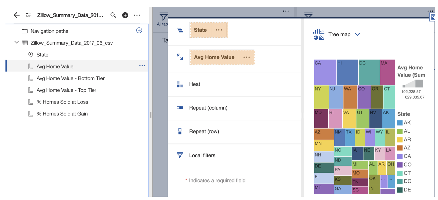
In the last example, I selected to add a “tree map” graph.
I used the “State” value as the identifier and “Avg Home Value” as the metric.
Share Your Dashboard
Once you feel happy with your dashboard, you’ll want to share it!
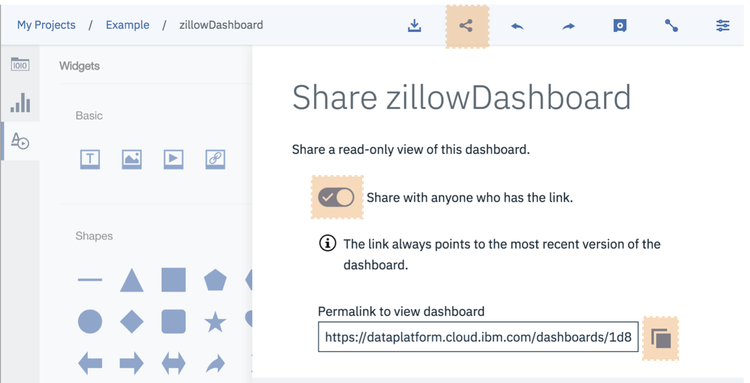
Select the connections button from the top nav. Move the slider over to enable sharing.
Copy the permalink and start sending it around.
Thank You
Thanks for reading along while we learned how to get started with dashboards in Watson Studio. Please share your thoughts and creations with me on twitter.